Wednesday, 17 March 2010

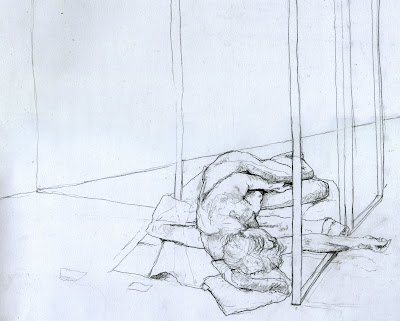
Tuesday Mornings


He is a life drawing I am quite proud of. There is a cropped version too. I have been really getting into figure drawing and recently did an essay on Jenny Saville, Euan Uglow and Egon Schiele who all really awesome.

Saturday, 13 March 2010

I have been busy (In my mind)


I have been really busy lately (at least in the worrying/over-thinking department) which has meant I haven't had much time for blogging. This is down to interviews. In particular, at an interview waiting room there were at least 25 people in there with me and I had my a2 portfolio and everyone else had a1 portfolios and I had a definite feeling of inadequacy. Its pretty funny now, it wasn't at the time though. But anyway, here is a little something I have been working on. I made a few t-shirts on Thursday and I'm making more next week and this is one of the designs. I will post more when I get them done. I may change the design because some people have been offended by the language. Personally, I think they need to grow up. See what I did there ?

Wednesday, 17 February 2010

Fur Project


Just a current Anti-Fur poster design project I am doing at college. This is just an idea and not a final design.

Thursday, 11 February 2010

Tuesday, 9 February 2010

Weathered Clothing Poster

Pages from a sketchbook


Top two are experimentation. Bottom two are artist research.

Monday, 8 February 2010

Type Exp

Sketchbook Development Pages


Here are some spreads of my A-Level Sketchbook work and some Foundation work. Logo Development mainly, with some editorial development.

A-Level Sketchbook Research Pages.


Here are a few spreads of my A-Level Sketchbook Research Pages.

Some Fun

Sunday, 7 February 2010

Bit of Illustration

Desk Job


I have created this just as a sort of Public Service Announcement. People see Graphic Design in many different ways. This is my opinion.

Sunday, 24 January 2010

LOVE HATE


I was just bored.

Saturday, 23 January 2010

It happens all the time.

"The worst two things in the world to not respond. Girls and Photoshop."

Tuesday, 19 January 2010

Magazine Project


Our first project as specialists in Graphic Design on my foundation course is to create a magazine cover and contents page. This is what I have settled on. The final piece will be a variation on these pieces and I will post it when I have done. This was a two week project. I have had about 5 days at college to work on it in reality though.

Sunday, 17 January 2010

5 books for £1 or 30p Each.


I found these books yesterday in a Second-hand shop near where I live so I bought them. I was extremely happy when I found these (probably more than I should have been). My favourite is the Postercraft book. I enjoy looking at the effort that went into the hand-making aspect of every stage of printmaking compared to the reliance on certain Adobe packages used currently. Anyway, they are good books and I thought they deserved mentioning.

NB. You will notice there are four books shown. The fifth book I bought was "The strange case of Dr Jekyll and Mr Hyde" (Just because I want to read it).

Tuesday, 5 January 2010

James Cameron


I have been to see Avatar and it is great. TV was made to represent reality (even if the stories are not realistic) and have done so for a long time. 2D has its obvious limitations on portraying real life (Its 1 whole dimension away). Logic only states that in the bid to create the most realistic representation of life is to use 3D. With this in mind, I decided to make this little piece to show the leap from 2D to 3D and how different the experience looks.

Sunday, 20 December 2009

Maritime Experiments


The images above are further work I have been doing on a college project called the Maritime Project. The images above are toner photocopies of my 3D physical sculptures. I believe the low-tech feel of the images makes the objects look much more aged. The main appeal of these images to me is the way that they make the objects look very much like x-rayed bones. This theme is one I have explored in the main project (linked above). The top two images are my main pieces and the two below them are alternate experiments with a similar theme. The lower two images show an "Extension Cord" that has been shaped to to suggest the whole skeleton of a whale (with ribs and tail).

Sunday, 13 December 2009

Tablet

As my gold-plated USB, Razer Diamondback mouse died on me recently I have been using the touch pad on my laptop. This is not good for anything really. So, I have just bought a Wacom, Bamboo electronic pen and tablet for my PC. I am excited to get it because my tendons on the back of my hands are starting to ache.

Logo by Michael Evamy

"A logo is like a lens that an organisation holds up to itself. If there is light behind the lens in the form of outstanding products, a memorable customer experience and excellent supplier relationships, it will shine; the logo will offer a piercing beam of positive associations. If there in no light, there is nothing to see and swapping the lens will not make a blind bit of difference."

I read this in a book I am currently reading. I just think that this quote is really true so I thought I would put it on here.

Saturday, 12 December 2009

Weathered logo revisited.


I have revisited the logo I designed for Weathered Clothing because after a few chats, I decided that my first logo was a little too unorigonal. The logo I have now settled on was one of my inital ideas for the logo and I have developed it to this. I feel the use of two different, yet recognisable icons, combine in such a way looks interesting (as well as being a visual pun on the company name).


Tuesday, 8 December 2009

Maritime Project


Above is an image of my final piece for a four day fine are project. The project was to create a sculpture/object that was inspired by a trip to the Hull Maritime Museum. More accurately, it was to use a found object in some way to create these inspired works. This could have involved resurfacing an object or deforming it for example.
My inspiration came from looking at the skeletons of the different whale species and the uses for the different bones of the animals. I was looking for objects when i came across a three-way plug adapter and began to see similarities in shape/form/colour etc between it and a single vertebrae. This exploration lead to my development of the "Spine" structure. I researched further into electrical peripherals and began to make more connections to the skeletal structure of whales and many electrical objects. This may be due to the nature of the insulative nature of the materials and their function.

Saturday, 5 December 2009

170gsm Cards.

I have recently began a project that involves me designing and making cards. My design plays on the weighting of different papers and cards and was partly inspired my the "Self descriptive" nature of a painting by John Balderssari. When I began designing the card I intended to use no ink and only a single piece of card. I experiemented with this idea and I am still developing it and hope that It will soon be a reality. I also experimented with ink to label the card which I feel creates a very contrasting image that is easily viewed. I designed the card in a very minimalist fasion to emphasise the card as the most important aspect of the design (rather than any decorative aspect that a traditional card would have). I have also created Christmas and Valentines Day cards that I will soon show on my blog. If you are interested in purchasing any of my cards then simply email me at callum_copley@hotmail.co.uk to arrage it. They are £1 each with a hand made envelope but I will discount larger orders.


Above is my first edition of my hand made birthay cards

Above are my inital experiments using the lead letters and the 170gsm card
Above you can see the way the card has been indented by the hammering of the letters.

Sunday, 29 November 2009

Ink and Glass


Here is some work that I created in my Fine Art studio session this week. The video shows the projected image of a slides I created. The slide contain varying amounts of sticky tape, dried ink and wet Indian ink. I chose to video the projection of the pieces as I found that the resulting images looked very interesting. They seemed to resemble a Eukaryotic cell in both colour and structure which was even more interesting considering that the ink was between two slides (like a microscope). I found the way the ink moved across the slide quite eerie for some reason. In some slides not shown in the video I managed to make the ink move extremely slowly (about 2cm per minute). This work with ink reminded me of the work by Andrei Molodkin involving ink and oil.

Close up still.
 
Clicky Web Analytics